Monday.com Review: Is This PM Tool Still Good in 2022?

Monday.com
Resumé
For a team to stay productive, they need to know what to do, have the resources required for each task, and be able to ask questions for clarification when needed. Monday.com lets you do all of this in one place and offers the flexibility to create a solution that fits your team like a glove.
The form feature allows you to get information into Monday.com easily, while automation and integrations aid communication with your clients with a minimum of effort. Pricing is quite competitive with other team management platforms, but it would be nice if they offered the entry-level tier for free, as Trello, Asana, and ClickUp do.
Every team is different. While many teams have found Monday.com a great fit, others have settled on other solutions. I encourage you to sign up for a 14-day trial to see if it works for you.
Hvad jeg kan lide: Use building blocks to create your own solution. Automation and integration features do the work for you. Colorful and easy to use. Flexible and highly customizable.
Hvad jeg ikke kan lide: A little pricey. No time tracking. No recurring tasks. No markup tools.
Indholdsfortegnelse
Why Trust Me for This Monday.com Review
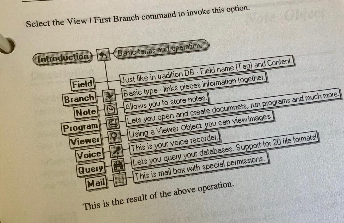
My name is Adrian Try, and I’ve been using computer software to stay productive since the 1980s. I enjoy programs that (like Monday.com) let you build a system piece by piece like building blocks, and one of my favorites was a little-known 1990s team-based information management tool called DayINFO.
My favorite task managers today are Ting and OmniFocus, but these are for individuals, not teams. I’ve played with a bunch of alternatives that are for teams, including AirSet, GQueues, Nirvana, Meistertask, Hitask, Wrike, Flow, JIRA, Asana, and Trello. I’ve also evaluated full-featured project management software like Zoho Project and the Linux-based GanttProject, TaskJuggler, and OpenProj.
In terms of regular day-to-day experience, a number of publication teams I’ve worked with over the last decade have chosen Trello to track the progress of articles from conception to publication. It’s a great tool and a close competitor of Monday.com. Which is best for your team? Read on to find out.
Monday.com Review: What’s In It for You
Monday.com is all about keeping your team productive and in the loop, and I’ll list its features in the following six sections. In each subsection, I’ll explore what the app offers and then share my personal take.
1. Track Your Projects
Monday.com is a highly configurable tool, and won’t come set up for your team out of the box. That’s your first job, so you’ll need to decide exactly what it is that you want to track. Your whole team will be working from Monday.com, so the time and thought that you put into its structure upfront can make a huge difference to their productivity.
How can your team use Monday.com? Here are some ideas to show you what’s possible:
- En ugentlig huskeliste,
- A social media schedule,
- Blogging planning and a content calendar,
- Ressourcestyring,
- Employee directory,
- Weekly shifts,
- A vacations board,
- Sales CRM,
- Supplies orders,
- Vendors list,
- User feedback list,
- Software feature backlog and bugs queue,
- Yearly product roadmap.
Fortunately, you don’t have to create everything all at once. It can be done one building block at a time and adjusted as your needs grow. Over 70 templates are available to give you a jump start.
The basic building block in Monday.com is the puls or item. (The platform used to be called daPulse.) These are the things you need to keep track of—think “keeping your finger on the pulse”. In most cases, they will be tasks that you check off when they’re completed. They can be organized in grupper, and placed on different boards.
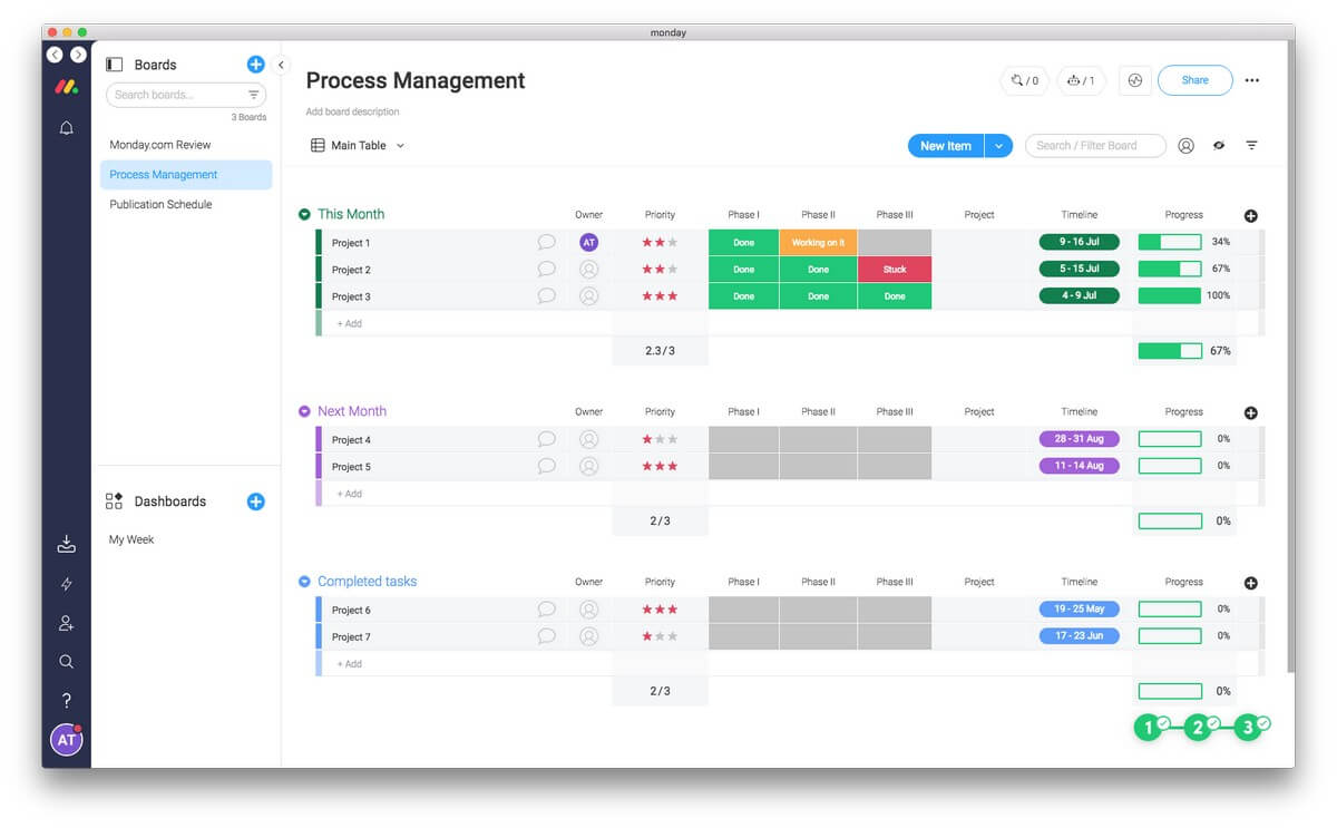
Each pulse can have different attributes, and you get to decide what they are. They could be the status of the task, the date that it’s due, and the person it’s assigned to. These attributes are displayed like kolonner in a spreadsheet. Each task is a row, and these can be rearranged by drag-and-drop.
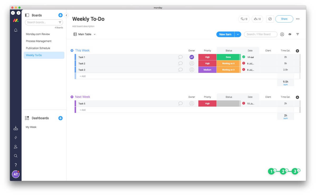
Here’s an example. One template is a weekly to-do list. Each task has columns for the person assigned, priority, status, date, client, and the estimated time required. The estimated time is totaled, so you can see how much time these tasks require over the next week. If you have too much to do, you can drag some tasks to the “Next Week” group.
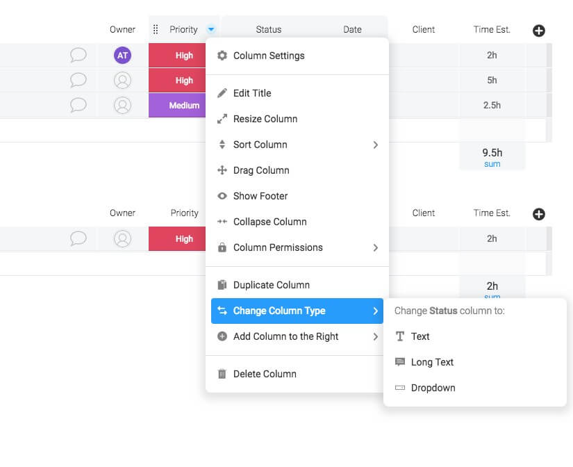
Columns can be edited from a drop-down menu. The title, column width, and location of the column can be changed. The column can be sorted and a footer added with a summary. The column can be deleted, or a new one added. Alternatively, a new column can be added by clicking the “+” button on the right.
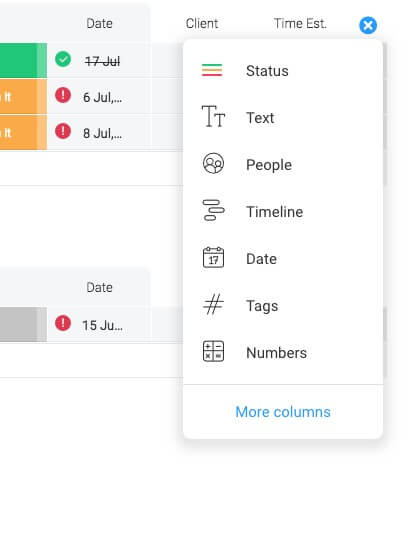
The values and colors of the columns can also be changed quite easily. Here’s the popup for editing Status.
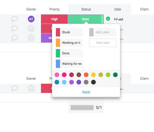
A pulse’s color-coded status can show you at a glance where it’s up to.
Min personlige holdning: Because Monday.com is so customizable, it should suit most teams. But there is an initial setup period before you can be productive with the app. Fortunately, you don’t need to set everything up at once, and the app will grow with you.
2. View Your Projects in Different Ways
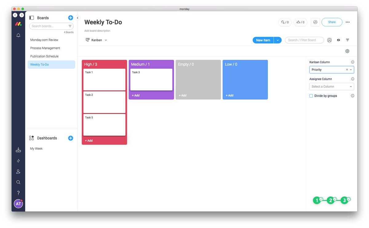
But a Monday.com board doesn’t have to look like a spreadsheet (called the “Main Table” view). You can also view it as a timeline, Kanban, calendar or chart. There are also views for displaying files, maps, and forms. That makes Monday.com very flexible.
For example, when using the Kanban view, Monday.com looks more like its competitor Trello. But here Monday.com is more flexible because you can choose which column to group the pulses by. So your weekly to-do list can be grouped by Priority…
… or by Status.
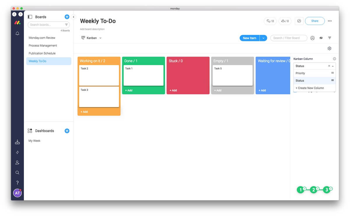
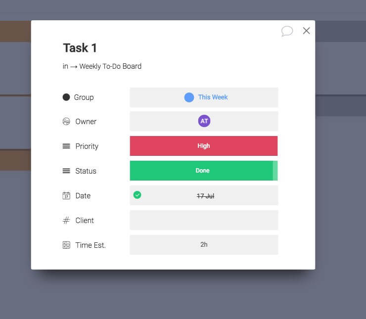
You can drag a task from one column to another and the priority or status will automatically change. And you can view the details of a task by clicking on it.
Tidslinje view is a much-simplified Gantt chart, similar to that used by other project managers. This view makes it easy to visualize and plan your week.
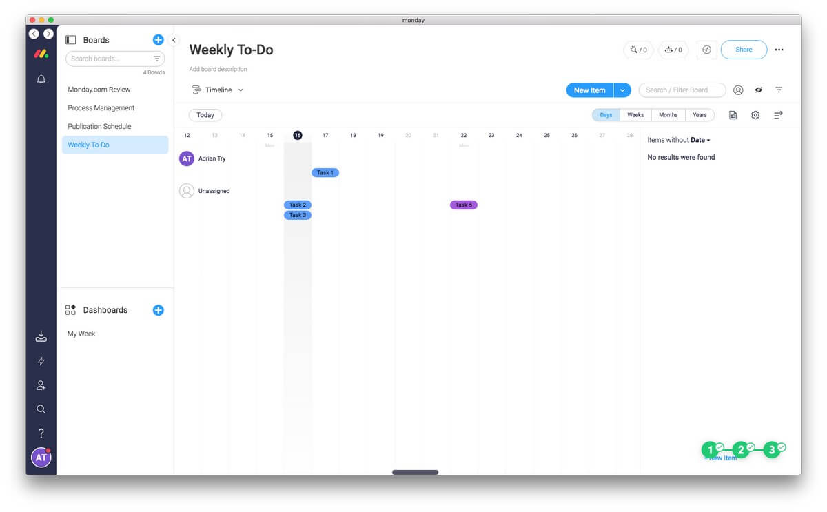
But it doesn’t have the power of a real Gantt chart. For example, dependencies are not supported. So if one task requires another to be finished before it can be started, Monday.com won’t automatically postpone the task until then. A full-featured project management app is designed to look after details like that.
Another way to visualize your week is the Calendar view, which we’ll touch on more below.
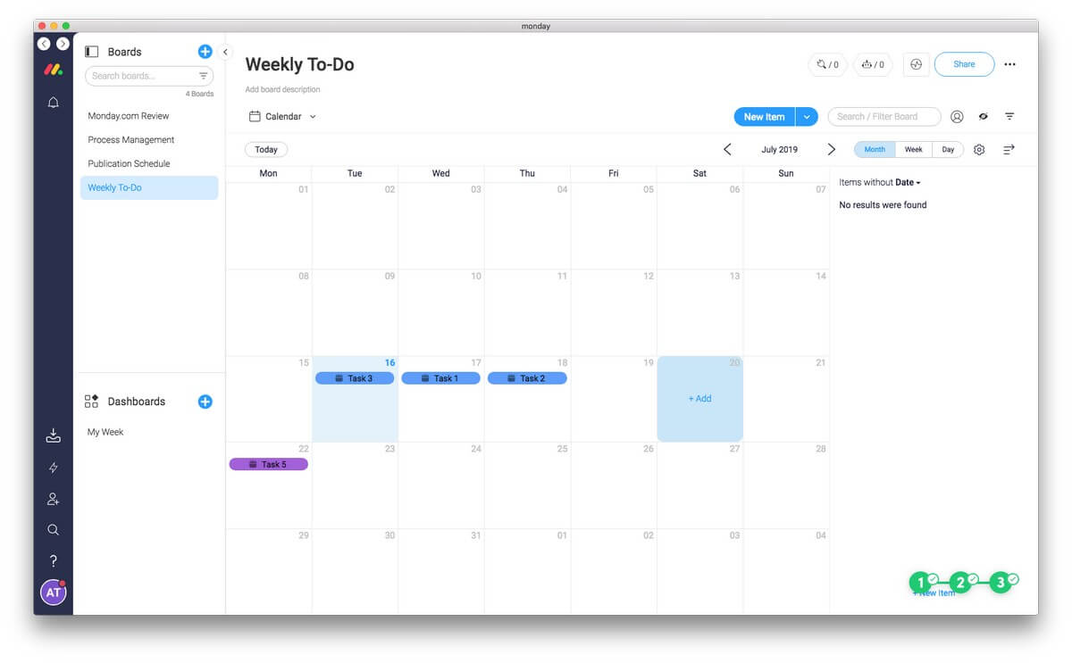
And depending on your needs, you can also view your board by location in a map view, or visualize your team’s progress with charts.
Min personlige holdning: Monday.com’s views give you different ways to visualize your projects. This makes the app much more versatile, allowing it to behave more like Trello, project managers and more.
3. A Central Place for Communication and File Sharing
Rather than sending emails back and forth about a project, you can discuss it from within Monday.com. You can leave a KOMMENTAR on a pulse and attach a file. You can mention other team members in a comment to get their attention.
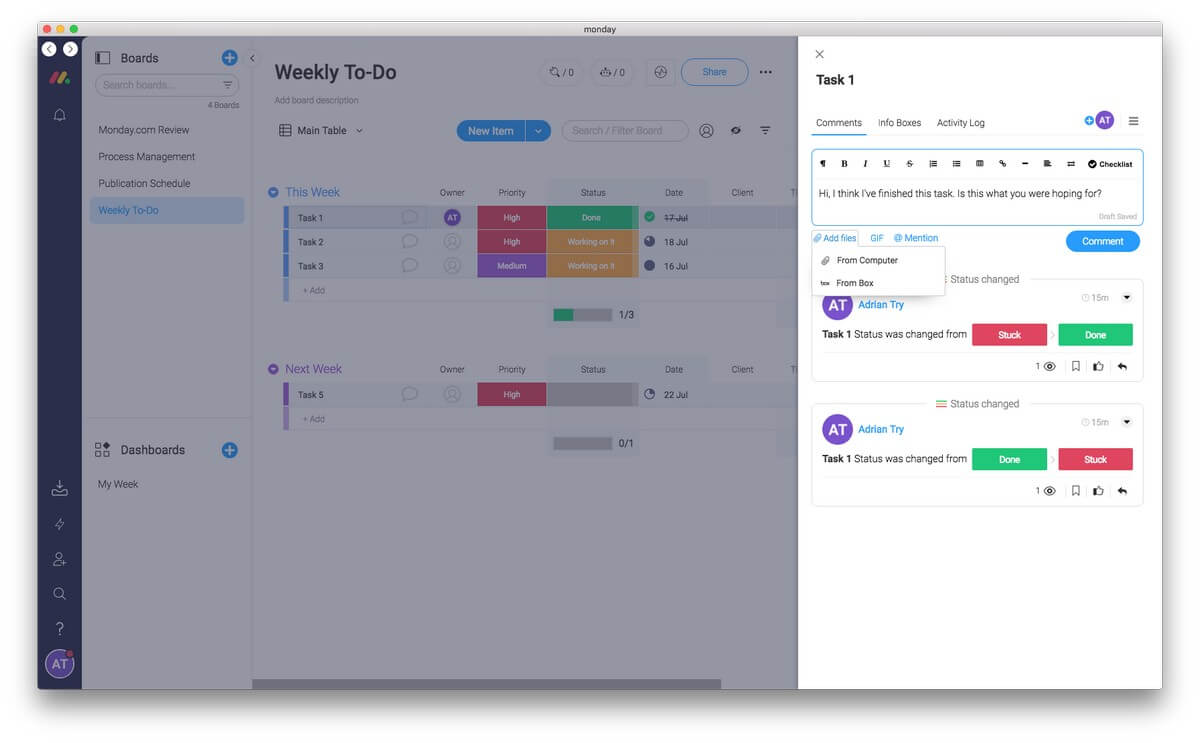
Comments can include tjeklister, so you can use a comment to break down the steps required to complete a pulse, and tick them off as you make progress. As you complete each item, a small graph indicates your progress. Use this as a quick and dirty way of creating subtasks.
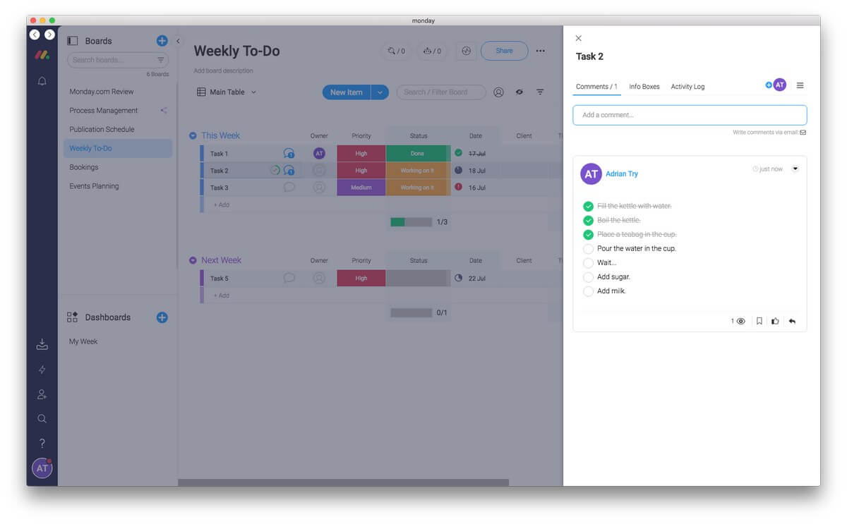
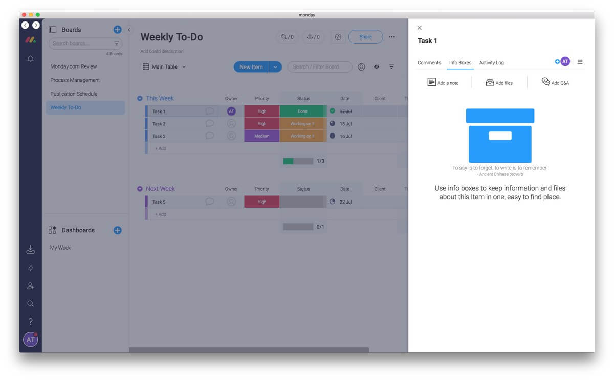
There’s also a place for adding reference material to a task. That may be detailed instructions, an outcome, files that are required, a Q&A, or just a quick note.
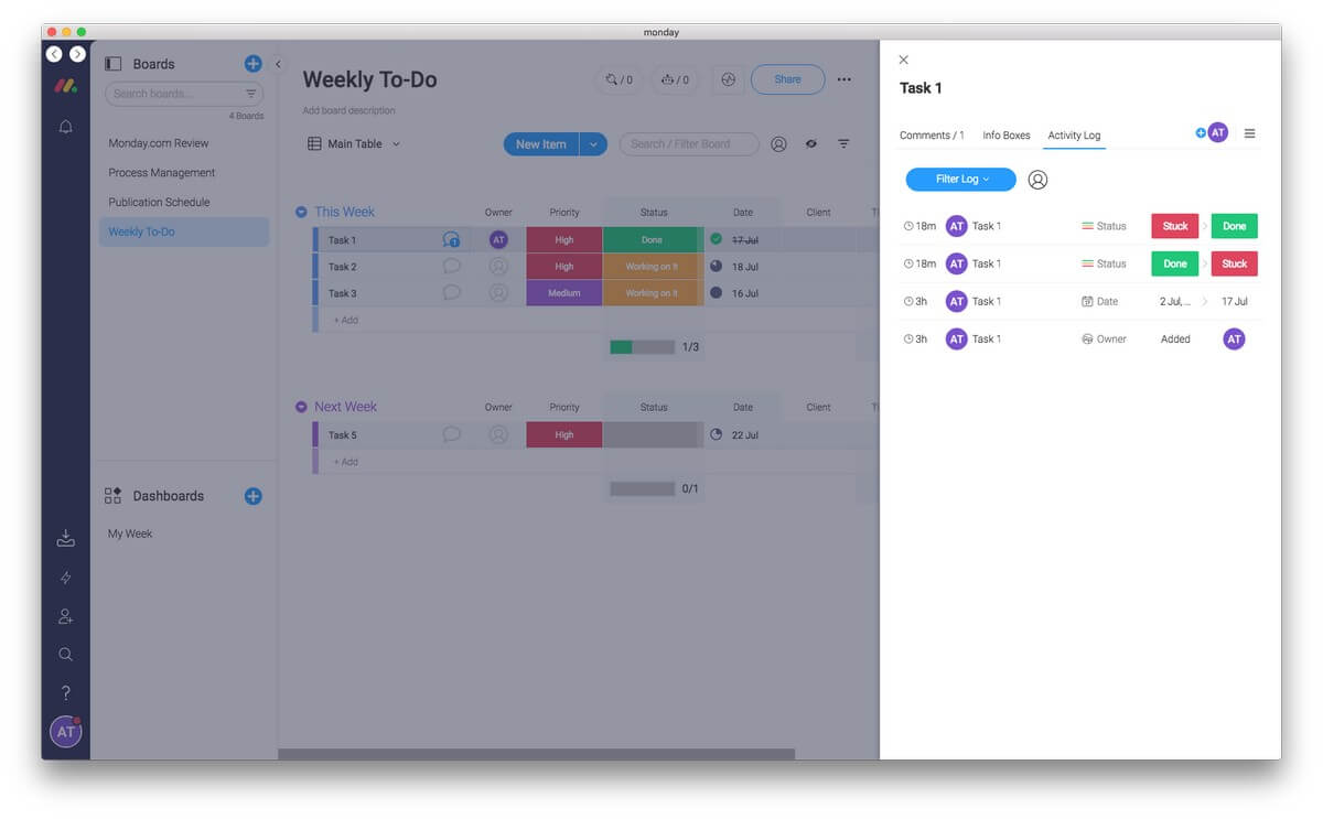
Og a log of all progress and changes is kept so you can keep up to date with what’s been done about a task, so nothing falls through the cracks.
Unfortunately, there are no markup tools. So while you are able to upload a PDF or image to illustrate what you want to be done, you’re unable to write, draw and highlight on it to facilitate discussion. That would make a useful addition to the platform.
Min personlige holdning: Monday.com can streamline your workflow and keep everything your team needs in one place. All of the files, information, and discussion about each to-do item is right where you need it, not scattered between email, messaging apps, Google Drive and Dropbox.
4. Use Forms to Power Your Workflow
Save time on data entry by having your clients do it for you. Monday.com lets you create a form based on any board and embed it on your website. Whenever a customer fills the form out, the information is automatically added to that board in Monday.com. For example, a customer can order a product online, and all of the details will be added to the right place.
A form is just another View of your board. To add one, use click on “Add View” on the drop-down menu near the top of your board.
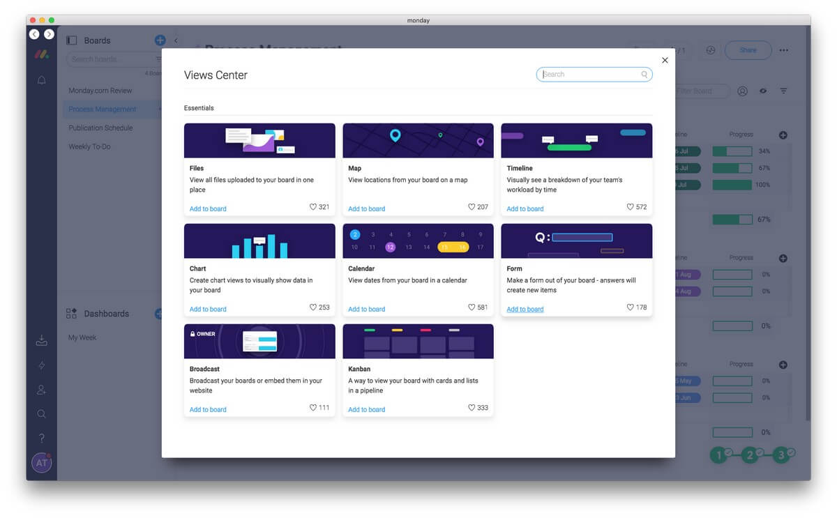
Once your board has an associated form, choose the Form view, customize your form, then embed it on your website. That’s pretty simple.
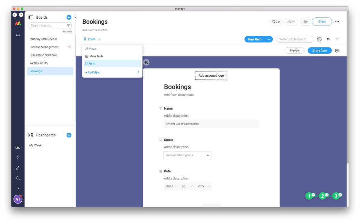
Forms have all sorts of practical uses. They can be used for ordering products, booking services, leaving feedback, and much more.
Min personlige holdning: Monday.com promises to keep everything your team needs in one place, and the embedded forms feature is a very helpful way to get additional information in there. They allow your clients to directly add pulses to your boards where you can track and act on them.
5. Calendars and Scheduling
Monday.com offers a calendar view for every board (assuming there’s at least one date column), and can also add pulses to your Google Calendar. In addition to that, there are templates for time and date-based activities including:
- Client scheduling,
- Events planning,
- Social media schedule,
- Campaign tracking,
- Content calendar,
- Construction schedule,
- Vacations board.
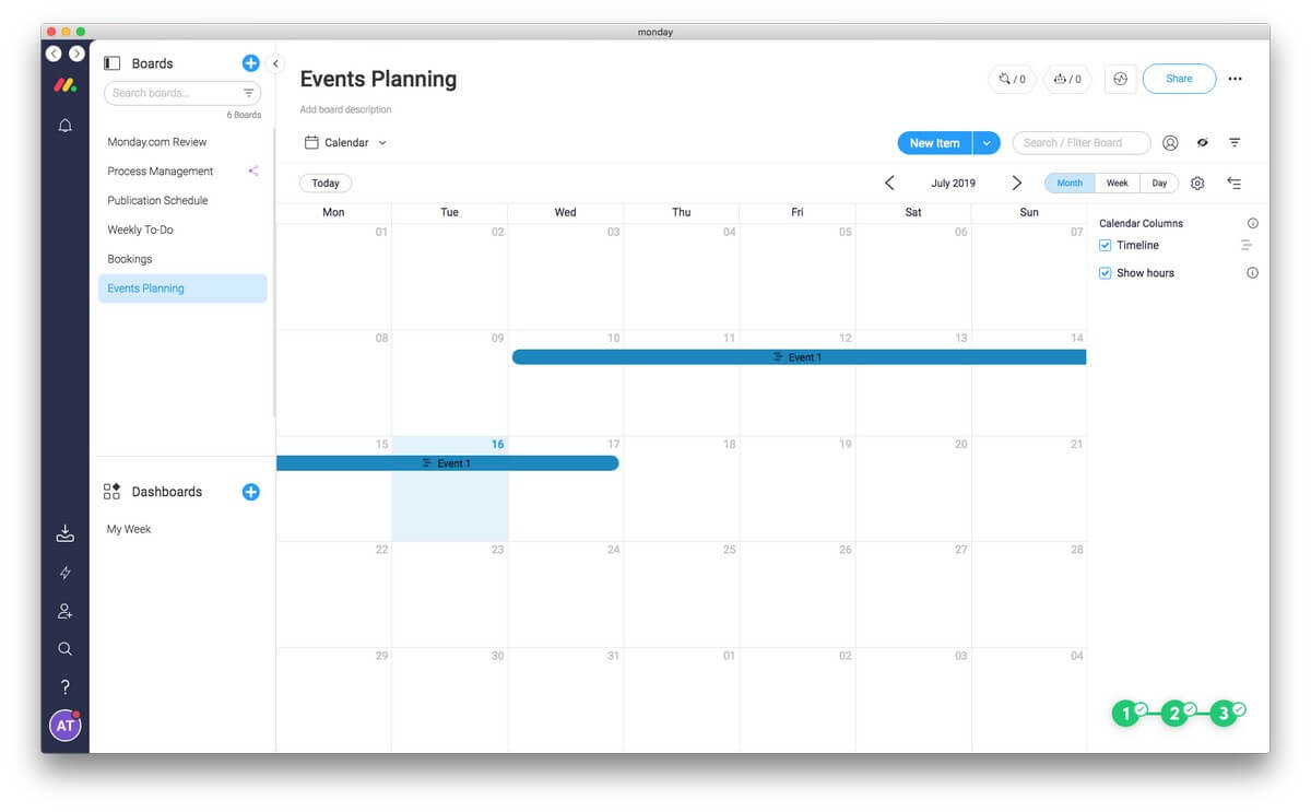
That allows you to use Monday.com to keep track of your time in all sorts of ways. For example, a real estate agent could have a calendar of when houses are open for inspection. An office could have a calendar of appointments. A photographer could have a calendar of bookings.
Unfortunately, recurring tasks and appointments are not supported. And some users found that their needs outgrew Monday.com’s ability to scale.
Time tracking is useful for billing purposes as well as seeing where your time actually went, but unfortunately, Monday.com has not included it. If you need to record how long you spent with a client, or how long you spent on a task, you’ll have to use another app to achieve that. Monday.com’s integration with Harvest may help here.
Finally, Monday.com makes it easy to create a variety of dashboard widgets that display tasks from across all of your boards on a single calendar or timeline. Make sure nothing gets overlooked.
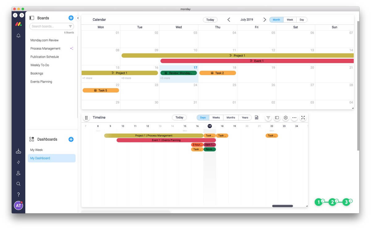
Min personlige holdning: Each Monday.com board containing a date can be viewed as a calendar, and you can create a calendar that displays your pulses from every board to get an idea of your time commitments on a single screen.
6. Save Effort With Automations and Integrations
Make Monday.com work for you. Automate! The app’s comprehensive automation features and integration with third-party services can take away time wasted on manual processes so your team can concentrate on what’s important.
You also have access to the Monday.com API, so you can build your own integrations if you have coding skills. All of this is available if you subscribe to the Standard plan or above.
Let’s look at an example. Imagine TechFewer was using Monday.com to keep track of our publication schedule. I’m currently working on a review of Monday.com that has the status “Working on it”.

When I finish the article and submit it for review, I would need to change the status of the pulse, drag it to a “Sent for Approval” group, and email or message JP to let him know. Or I could use Monday’s powerful features.
First, I can use automatisering to move the pulse to the right group just by changing the status. I click the little robot icon at the top of the screen and choose an action.
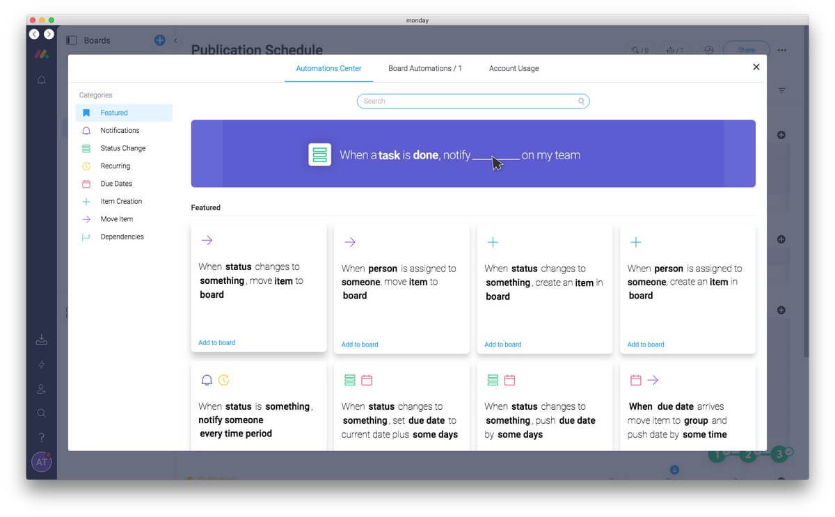
I find what I’m looking for and change the defaults.
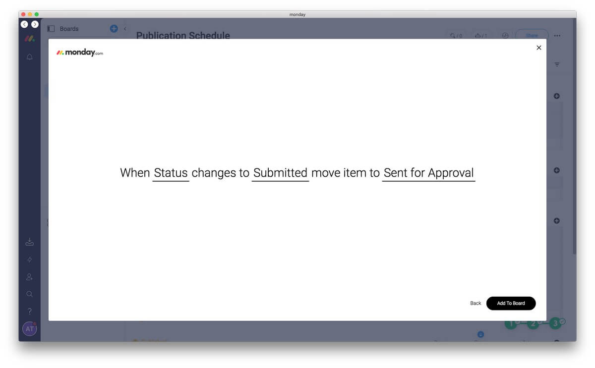
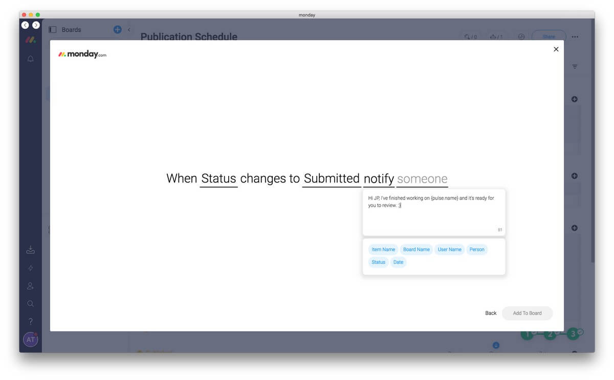
Now when I change the status of my task to “Submitted” it will automatically move to the “Sent for Approval” group. And going further, I can also notify JP through Monday.com that the article is ready for him to look at by creating another action.
Or by using integrationer I could notify him some other way, say by email or Slack. Monday.com can work with a wide range of third-party services including MailChimp, Zendesk, Jira, Trello, Slack, Gmail, Google Drive, Dropbox, Asana, and Basecamp. I can even attach a Google Docs draft of the article to the pulse.
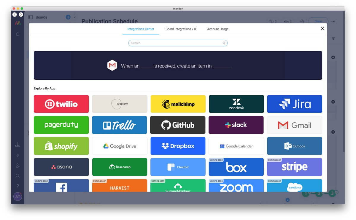
The way Monday.com can automatically send an email when you change a status (or some other attribute) is incredibly handy. An HR department can automatically send a rejection letter when the status of an application changes to “Not a good fit”. A business can send an email to a customer that their order is ready just by changing the status to “Ready”.
The Standard plan is limited to 250 automation actions each month and another 250 integration actions each month. If you become a heavy user of these features, you’ll need to keep an eye on your usage. The Pro and Enterprise plans increase these numbers to 250,000.
Min personlige holdning: Forms make it easy to get information into Monday.com. Integrations make it easy to get information out. You can create customized email templates for a variety of scenarios that are sent out automatically by just changing a status. Or you can add additional functionality to Monday.com through well-thought-out automation.
Reasons Behind My Monday Ratings
Effektivitet: 4.5/5
Monday.com’s versatility allows it to become the hub of your business. Its flexibility makes it suitable for a wide range of scenarios. It lacks recurring tasks and markup tools, and one user found that the scheduling feature didn’t scale to their needs, but most teams will find that this app offers a lot to enhance their productivity.
Pris: 4 / 5
Monday.com is certainly not cheap, but it is quite competitive with the cost of similar services. It would be nice if the basic plan was free, something that both Trello and Asana offer.
Brugervenlighed: 4.5 / 5
Building a custom solution with Monday.com is quite easy to do. Like I said before, it’s a lot like building with lego. You can do it piece-by-piece and add features over time as you need them. But before your team can use the service you’ll have to set up a few boards.
Support: 4.5/5
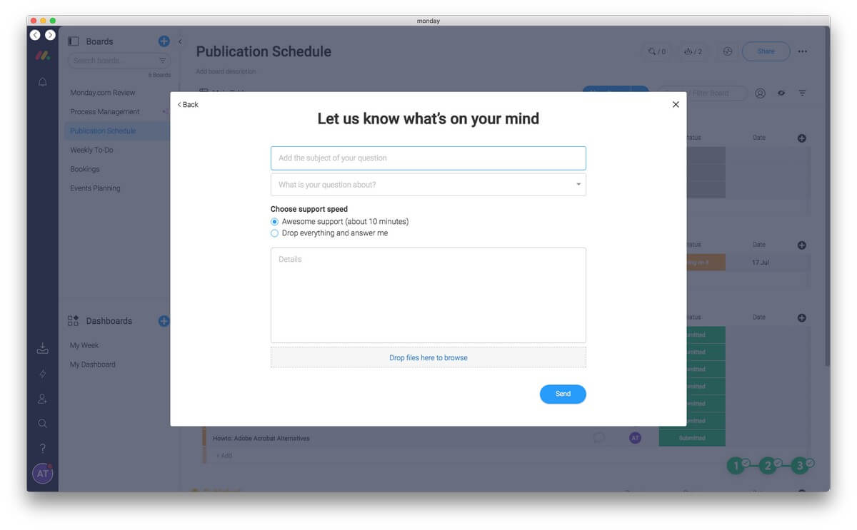
The app’s built-in help feature allows you to type a few words to find the information you need. I had to do that several times while writing this review—it wasn’t obvious where to start when creating forms and actions. A knowledge base and a series of webinars and video tutorials are available, and you can contact the support team via a web form.
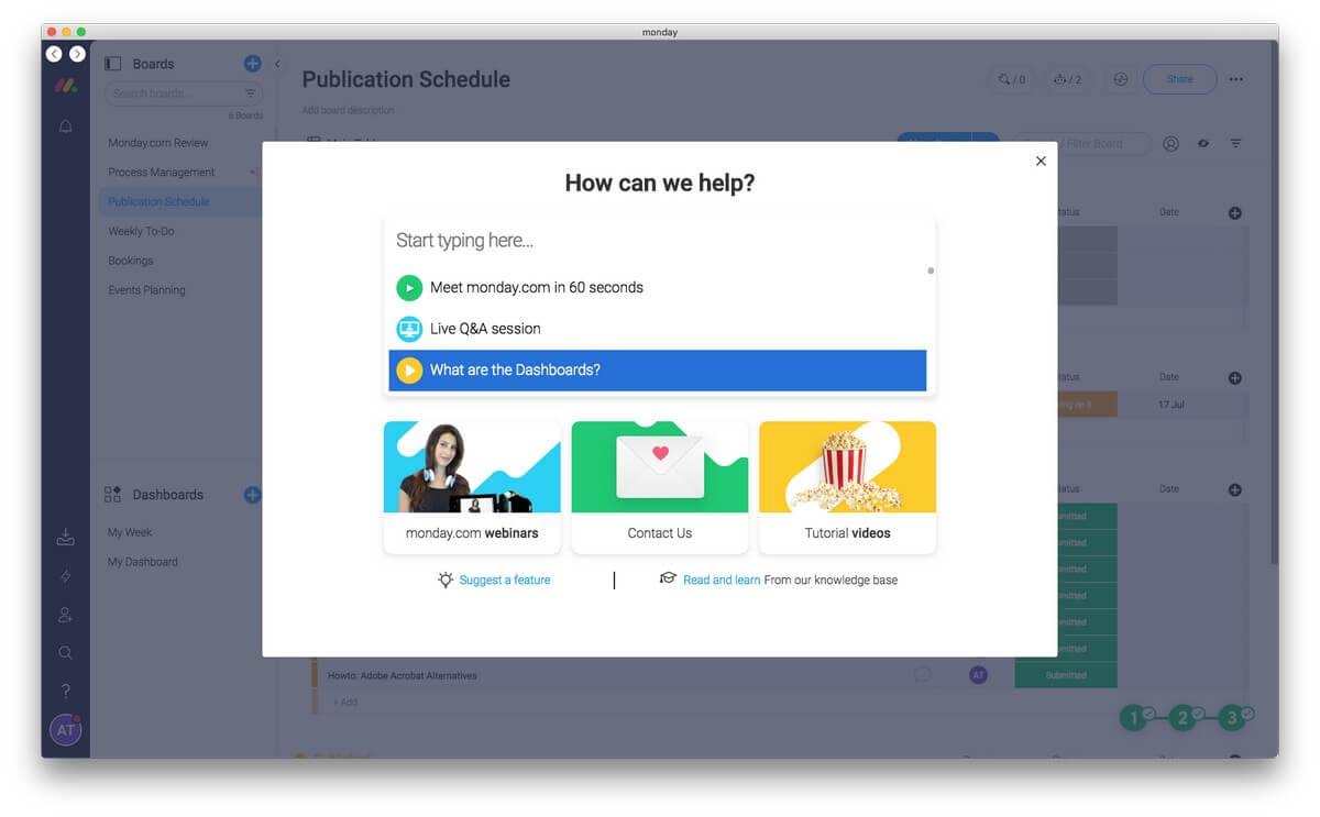
I laughed out loud when I saw the support speed options: “Awesome support (about 10 minutes)” and “Drop everything and answer me”. A support email address and phone number are listed on the site’s contact page.
Alternatives to Monday.com
There are plenty of apps and web services in this space. Here are a few of the best alternatives.
Trello: Trello (from $9.99/user/month, a free plan is available) uses boards, lists, and cards to enable you to collaborate with your team (or teams) on a variety of projects. Comments, attachments, and due dates are included on each card.
Asana: Asana (from $9.99/user/month, a free plan is available) is also designed to keep teams focussed on goals, projects and daily tasks. Tasks can be viewed in lists or on cards, and a snapshot feature shows how much work team members have, and allows you to reassign or reschedule tasks to keep work balanced.
Klik på Op: Klik på Op (from $5/user/month, a free plan is available) is another customizable team productivity app, and boasts over 1,000 integrations with third-party services. It offers a number of views of each project, including time, list, board, and box. Unlike Monday.com, it supports task dependencies and recurring checklists.
ProofHub: ProofHub (from $45/month) offers one place for all your projects, teams and communications. It uses Kanban boards to visualize tasks and projects as well as real Gantt charts with dependencies between tasks. Time tracking, chat, and forms are also supported.
Konklusion
Want to keep your team moving? Monday.com is a web-based project management platform that’s flexible and highly customizable. It can become the hub of your organization.
Launched in 2022, it’s a powerful task-management app for teams that allows everyone to see progress and stay on track. It streamlines and centralizes communication, reducing the amount of email you need to deal with and simplifying document sharing. Everything your team needs to get things done is in one place.
Tasks can be displayed in lists like a task management app, Kanban boards like Trello, or a timeline like a project manager. Monday.com is more powerful than Trello and Asana but lacks the advanced features of full-blown project management software like Microsoft Project.
It’s a web-based service with an attractive, modern interface. Desktop (Mac, Windows) and mobile (iOS, Android) apps are available but basically offer the website in a window.
Monday.com offers a free 14-day trial and a range of plans. The most popular is the Standard and costs around $8 per user per month. Plans are tiered, so if you have 11 users, you’ll be paying for 15, which effectively increases the price per user (to $10.81 in this case). The Pro version costs 50% more and offers additional features.
These prices are expensive but competitive. Trello and Asana offer similar services, and their popular plans cost around $10 per month per user. However, their entry-level plans are free, while Monday.com’s is not.
So, what do you think about this Monday.com review? Leave a comment below.
Seneste Artikler